


Sharing is caring!
Undoubtedly, mobile devices currently dominate the internet. In 2017, mobile devices accounted for more than 52% of total global internet traffic, and this number is rapidly increasing. So, is your website prepared for the future of mobile? Unfortunately, it is no longer an option to make your website mobile-friendly. In reality, Google now considers a website’s mobile-friendliness when ranking it and penalizes those that aren’t optimized for smartphones and tablets. A full stack development agency can assist you in creating a mobile-first website. But how?
Whether users are surfing or looking for specific information or services, your website must run well on mobile devices. Any loading lag or navigational annoyance can drive interest and traffic to your competitors’ business websites. Many websites use a mobile-first design approach to avoid this.
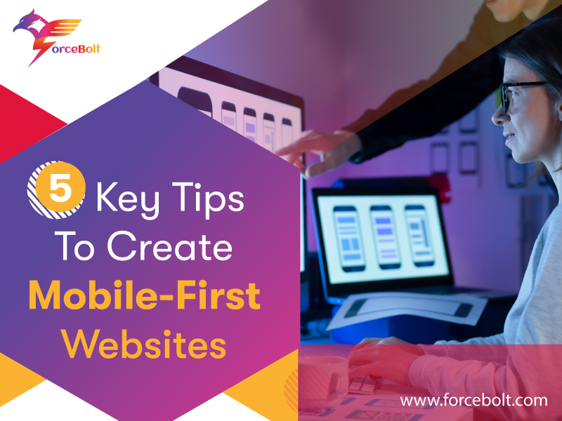
What Is Mobile-First Design?
The term “mobile-first design” refers to creating screens and designs optimized for the smartphone’s smallest screens available. It means that the designs will be customized for a smartphone user’s experience and will only show the essential features and information that your users require.
Because of the limited screen size, the designer should focus on the most crucial aspects of the project. More levels of functionality and content can be added for tablets and desktops after determining what content you need to show. This method is known as progressive enhancement, and if done correctly, it ensures that the correct version is delivered to the correct screen at all times.
Therefore, here are a few ideas to make your site more mobile-friendly if you’re planning to construct a new website or update an old one to satisfy the current Google algorithm adjustments.
1. Utilize A Responsive Framework
HTML frameworks have made it easier than ever to create responsive websites. Popular mobile-first frameworks like Bootstrap and Foundation are now being used to develop front-end and back-end user interfaces that can be readily optimized for mobile devices. When you utilize an HTML framework, you don’t have to optimize a design for mobile devices because the framework does it for you.
2. Prioritizing User Experience
The main goal is to provide a positive user experience for visitors to navigate the site and learn more about your product and brand. This is why it’s critical to make the website as user-friendly as possible. Specific components of a website’s design must be adjusted to fit different screen sizes. The text on a desktop website, for example, does not seem the same on a mobile device. In addition, when viewing sites with tiny fonts, users must frequently zoom in. Therefore, this can negatively impact the user experience.
3. Optimize Website Speed
When it comes to SEO and user experience, the speed with which a website loads is crucial. Do everything you can to make your website as fast as possible. You can begin by using the tactics listed below to improve the performance of your website. You can install a caching plugin, install a CDN, optimize the images, switch to HTTPS, etc.
4. Streamline Interactions And Navigations
When designing a mobile-first website, several elements of your design must be structured differently. For example, if your desktop website has an extensive navigation menu, showing it on a mobile screen will take up half the area. Instead, a menu button can be used to hide the navigation links. In addition, consider employing interactive buttons instead of text links and use mobile-friendly image galleries with swipe movements to make browsing easier.
5. Test And Make Improvements
The next important step is to test your website design to ensure the website look across various devices, platforms, and browsers. These people should be able to view your website as well. Make sure your website looks just as good on an older Android phone as it does on an iPhone. Finally, you can evaluate the responsiveness of the website design, and you should consider A/B split testing your landing pages to get the greatest results.
Conclusion
Each designer takes a distinct approach to web design jobs. Therefore, there is no one-size-fits-all approach to creating a mobile-first website. However, to ensure that your website appeals to end customers, you must adhere to specific guidelines. To generate better mobile-first websites, follow our advice, listen to your visitors, and continuously upgrade your design to keep up with the latest trends.
Are you searching for a ReactJS Development Services to help you with your web application development projects? Then connect with ForceBolt ReactJs Developers, who will help you with your upcoming ventures.

Abhishek Singh
Full Stack Technical Lead
A highly motivated Senior Full Stack Developer who is self-driven and actively looks for ways to contribute to the team. He possesses rich expertise and deep knowledge about a good software development process that includes documentation, testing, documentation, and collaboration. With solid communications and reasoning skills, he delivers high performance and quality in his projects. He is always open to assist other teams in understanding project requirements so that collaboration can happen in the best possible ways in an environment conducive to the business.